HauteLook Teams with Cloud Four to Launch Mobile Web Site

 Over the last year, we’ve been talking to people all over the country about what it means to have a comprehensive mobile strategy. That’s one of the many reasons why we were so pleased to work with HauteLook on their mobile web site.
From the very first conversation we had with HauteLook, we were impressed with how they were approaching their mobile strategy and how their infrastructure was built in a way that gave them flexibility to support new devices via robust APIs.
One of the things we talk to customers about is what I refer to as the email problem. It isn’t so much a problem as a user scenario.
Someone sees something that you offer that they are interested in sharing with someone else. Maybe they email a link to their spouse. Or they share it on Facebook or Twitter.
What happens when they follow that link? They go to your web site. What is the experience like if the person is on a mobile device? Is that experience representative of your brand?
This is especially important for companies that have social media campaigns. Links are social media currency.
The challenge is to make sure that when a customer reaches your site that
- no matter what device they are using,
- no matter where they are in the world
that you provide them with the best possible experience.
HauteLook got this from the very beginning. They wanted to support as many mobile phone users as possible.
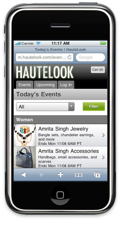
To that end, the m.hautelook.com can be used on everything from feature phones with screens as narrow as 128 pixels to images optimized for the iPhone 4’s retina display.
Every morning, HauteLook members receive emails letting them know what the sales are that day. Those links point to the desktop web site. But when those links are viewed on a mobile device, you get a mobile-optimized version of the same page.
The email blast also triggers a morning rush of traffic. The traffic spike is significant enough that performance was key. John and Lyza spent a lot of time working on both the front and backend to make sure the site was fast under the heaviest of loads.
And mobile web is only one part of HauteLook’s mobile strategy. They worked with our friends at Small Society to create an iPhone app for HauteLook members that offers features like push notifications and reminders.
There’s a lot more to this project than can fit in a single post. Everyone at Cloud Four helped in some way to make the site a success. There are lessons from this project that we can’t wait to share.
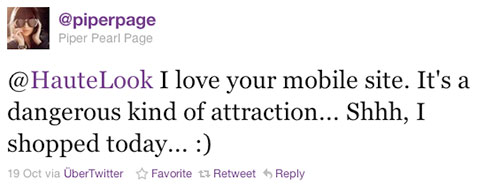
But for the moment, we just want to thank HauteLook for the opportunity to work with them on such a great project and to thank those people on twitter who have given positive feedback. Nothing made us happier than seeing comments like this one from a Blackberry user who said:
That’s why mobile is amazing. Provide a great mobile experience and your customer will not only use it, but they’ll love you for it!
Jason Grigsby is one of the co-founders of Cloud Four, Mobile Portland and Responsive Field Day. He is the author of Progressive Web Apps from A Book Apart. Follow him at @grigs.

